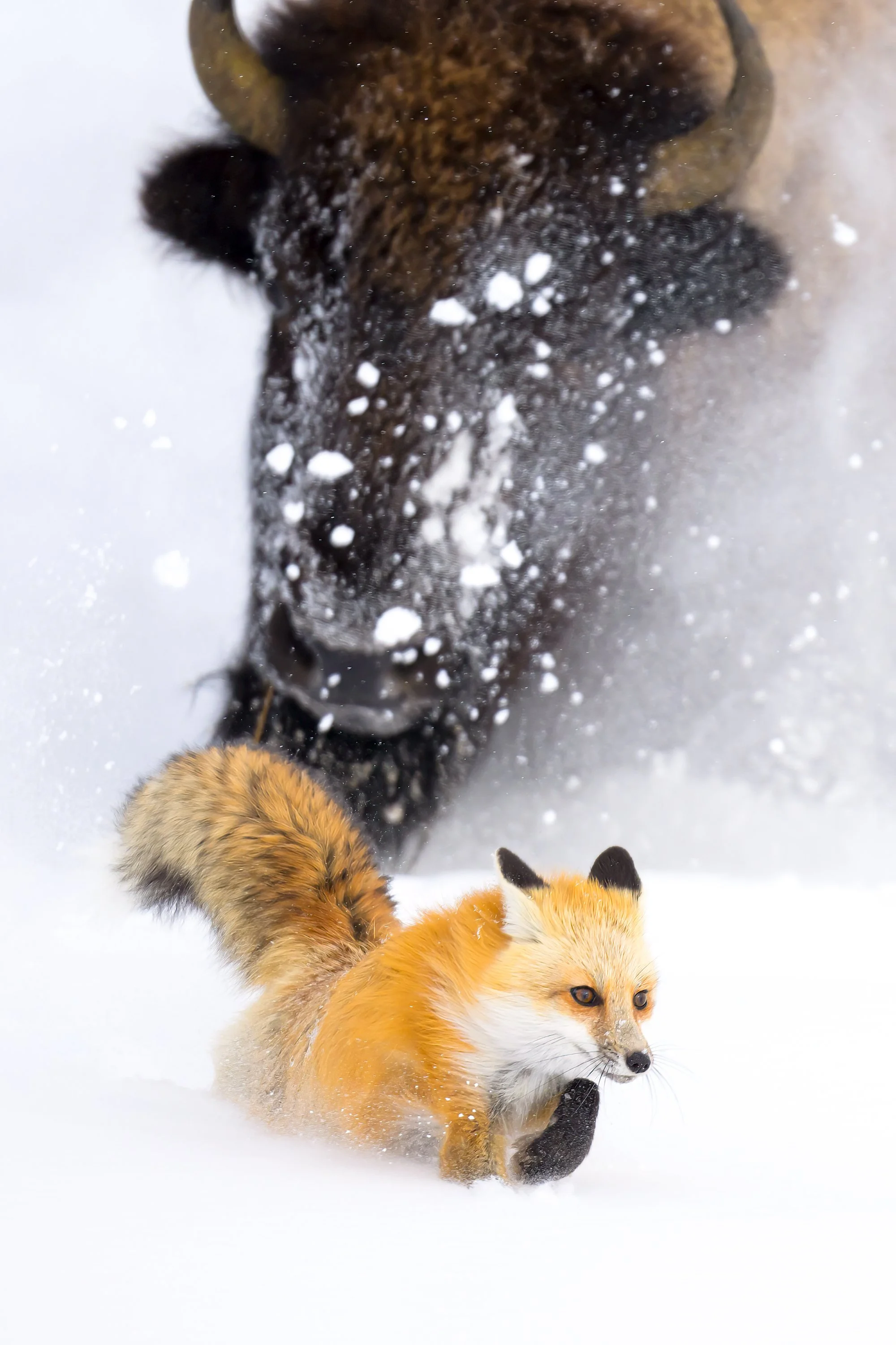
The Fox and the Minotaur
A while back, I began working on a series of articles called the Art of Composition. The first few articles were all about depth of field for a very specific reason: DOF is how we deliberately choose to emphasize or deemphasize the various “stuff” in our compositions. But as the series progressed, I ventured into the Elements of Design.
Any serious discussion of composition inevitably includes the Elements of Design: line, shape, form, value, space, texture, and color.
Why?
Because every piece of visual art can be distilled down to these 7 things.
Chief amongst these is line. Everything builds upon this. It’s why it’s the first in the lineup.
Lines lead the eye. Lines imply things. They can create harmony and they can create tension like Baroque lines.
If you have ever found yourself frustrated with your images after photographing an animal in or near the forest, chances are that frustration comes from all the competing lines in the background. Forests are terribly difficult to work inside of for this reason; sticks and twigs and leaves and branches and all the beautiful chaos of nature. And while there is some very real science behind that swirling vortex of entropy being good for our psyche when out in nature, once compressed into a two-dimensional photograph, more often than not, it’s all just one big mess.
And this is exactly where understanding depth of field comes into play.
Photographing a bird in the forest? If you understand how to shrink your depth of field down to a razor thin section of the composition, you can isolate your subject from all the chaos.
In those early articles, I explained how distance and focal length are usually more important than f/stops and apertures when it comes to using DOF to control our compositions.
Consider the following. . .
Let’s say you found an owl in the forest, and you’re using a 600mm f/4 lens. If you shoot this at f/8 from a hundred feet away, you will have a depth of field of 4 feet. That’s a lot.
But let’s look at this same situation stopped down to f/4. Even at this aperture, you still have a DOF of 2 feet.
While it’s better than 4 feet, a lot can still go wrong in a composition inside 2 feet – especially in the forest. Anything within a 2-foot bubble around the subject will be rendered perfectly in focus. Those branches in the background intersecting with the head? The one you didn’t see in front of the owl? Lines, every one of them. And all of them will be in focus.
But let’s halve that distance. Same lens, same subject, same sequence of settings.
Using f/8 at 50 feet gives us a DOF of 1 foot.
Using f/4 at 50 feet gives us a DOF of 0.5 feet.
With a depth of field of only 6 inches, you now have a lot more CONTROL over your composition. You can more easily isolate your subject. You can render branches into a bokeh-licious background. And, importantly, you can get closer still to reduce it down even further. This is, in a nutshell, why I focus so heavily on fieldcraft. Understanding an animal, their behavior, how they read and experience the world, and knowing how to get close to them is all about having control over my compositions.
So, while f/stops have an important impact on DOF, it’s distance that will have the greatest impact on the way your photographs actually look.
But there is more to this story.
After publishing those articles, a lot of photographers approached me to say that the discussion of DOF completely changed the way they think about photographing wildlife. But the one question that keeps popping up is, “what do you do with more than one animal?”
It’s a fair question.
And my answer to this is simple: 99.9999% of the time, I’m going to use the largest aperture I have available.
Why?
Because of what artists call Visual Hierarchy.
Look away from the computer or phone for a moment and focus on something. Hold your eye there and notice how everything else falls out of focus around that spot.
If you are looking at your keyboard, focus on the G key. Notice how you can still see the necessary details in the surrounding keys to tell exactly what letter they represent.
If all you could see was that letter G surrounded by whatever color the key is, you technically wouldn’t know if it was even a keyboard you were looking at.
But pull back to a more natural viewing distance, and the surrounding keys, the T the Y the F the H, are all completely out of focus but contain enough visual information so you know exactly what they are even though you are still looking at the G on your keyboard.
Taken as a whole, a photo focused only on the G key with those surrounding keys now gives you all the information you need to know about what you are looking at.
The human eye has evolved to see only one single spot in focus, and that spot is razor thin.
Artists have understood this for millennia. And to work with how the human eye functions and how the brain processes information, we developed the concept of Visual Hierarchy.
Visual Hierarchy is an artist’s way of assigning importance within the composition predicated on the actual biology of the human eye. The subject is selectively focused on and then everything else is subordinated to that subject based on the order of importance.
But understand this: the subject itself is never the only important element in a composition. Other things, animals, or people, become secondary elements that support the main subject. Painters like Rembrandt subordinated these supporting elements by simplifying detail, softening edges, and reducing contrast. All of which is exactly what happens to something as it falls outside of our depth of field bubble in a photograph.
And that’s exactly what you are seeing in the other letters surrounding the G on your keyboard.
While I have a feature article planned for the upcoming issue of PhotoWILD (Fall 2026) all about Visual Hierarchy, I wanted to share an example of this just so you can get a feel for how it works.
Instead of fretting over other animals in a composition being in focus, I design my compositions to embrace those other animals as secondary elements the same way classical painters did.
The photograph at the top of this article was made during my Winter Wildlife of Yellowstone Workshop last year, and is a perfect example of this concept.
This fox had been hunting around a herd of bison for several hours. My group was alone in the snow with these animals save for two friends of mine who were filming for an upcoming BBC documentary, when suddenly this bison charged the fox.
I was sitting in the snow with a 400mm lens in my hands. Resting on my camera bag beside me was an 800mm. Instead of stopping down to capture detail in the two animals, I dropped the 400mm and grabbed the 800.
Remember, focal length is just as important as distance when it comes to depth of field. So, an 800mm lens, is going to have a significantly shallower depth of field than a 400mm at the same distance. And my plan was to embrace that.
The result of that charge, combined with the fact that I was shooting wide open, allowed me to create something that has never been photographed before and in a way that will likely never be again. And the power of the image comes not from the charge itself, but from what the extremely shallow depth of field did to the bison in the background.
Imagine if I had stopped down, if I had gone to f/8 or f/16 to capture detail in the bison.
How different would this photograph be?
Details would have ruined the photograph.
Instead, we have some sort of monster from our nightmares, like the Minotaur of ancient Greece, captured in a photograph. All I needed was the shape of that head and horns filling the background to invoke that feeling.
The success of the photograph is hinged upon what’s implied. And maybe, just maybe, that’s really the point.
By removing detail, we add meaning.
Cheers,
Jared Lloyd